Whether your business collects personal data on customers, has helpful articles or simply wants to educate visitors about your products or services, you've got a need to organize and share this information. Figuring out how to create a network that gets this knowledge to the end user without confusion or frustration can seem like an overwhelming task.
This is where Knowledge Base Management comes in. Knowledge base management is a method of organizing your business's information and presenting it to the agents or customers in a logical, educational and above all-headache free manner. We've pulled together 4 best practices for helping you create and streamline your knowledge base.
The first step in knowledge base management is determining your audience and their needs. Are you organizing information for your support center, help desk, or your customers? Do they search for specific information, need help with tasks or do they browse? Grouping articles or information in a way that makes sense for both your service or product and the end user keeps frustrated customers from taking their business elsewhere.
Think of your information as a map that will guide your users like highway signs. Begin by listing broad categories that point down a specific road. Break down these larger categories into smaller section headings that can further be divided into sub-categories. Using plenty of white space and a variety of font sizes creates a clean, organized format that's easy to follow.
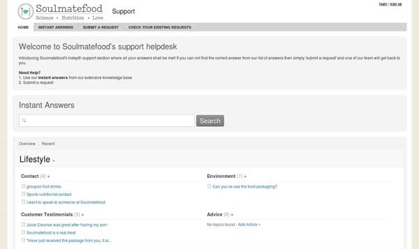
Soul Mate Food Support is a great example of this outline map. They've used broad headings in large fonts to direct customers. Under these headings they've created categories and further delineated these categories into subheadings. Customers can easily follow links to find more information, to answer questions or read more on specific topics.
You hear it time and time again-keep it simple! And nothing could be more true when it comes to creating your knowledge base. The language you use should be easy to read and without technical jargon that will have users scratching their heads and giving up.
It's important to stick to a small number of broad categories with simple titles rather than numerous overly specific topics which can confuse both authors and users. Using the adage of "show don't tell" and including icons with your category titles saves time and confusion.
As your company grows and your needs change, so should your knowledge base. Be sure you've set it up to allow expansion of additional category headings as well as more specific sub-categories.
GovDelivery Support has broad categories highlighted with quick-reference icons. We really like the way they've made it easy for the user to navigate to more specific topics within broad categories without confusion.
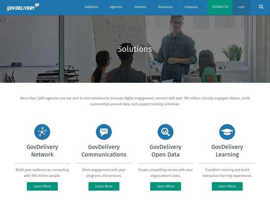
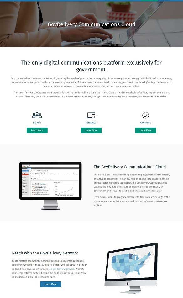
Clicking on the "Learn More" button located below GovDelivery Communications opens a web page (shown below) which offers the user more specific categories. These categories invite the customer once again narrow their inquiry and further streamline their information search.
Though it's easy to come up with headers and categories that make sense to you, it's your customers or agents who will ultimately be searching for the wealth of information you're looking to share. Categorize behaviors, habits and preferences using search terms and language your typical end user will understand. Keeping in mind that technical expertise operates on a spectrum, your knowledge base should be geared to the user who is unfamiliar with your product. Don't assume your end user understands technical jargon or business-specific terminologies.
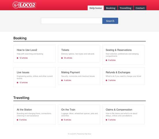
Loco2's business is booking train tickets. They know their users will likely be using their help page to answer inquiries related to "Booking" and "Travelling". They also understand their end user could be lost in a train station, desperately seeking answers. Loco2 doesn't want to offer them a series of complicated headings that add to the possible confusion and frustration of traveling.
People have short attention spans. Users don't want to spend their time searching for a particular topic. Take a close look at the most commonly searched categories of your knowledge base and be sure to keep them at the top of the page. In general, quick reference articles such as "How to Get Started", "Helpful Hints" and FAQ's should be found at or near the top of your knowledge base, moving down to less searched topics as you scroll to the bottom, saving customers both time and headaches.
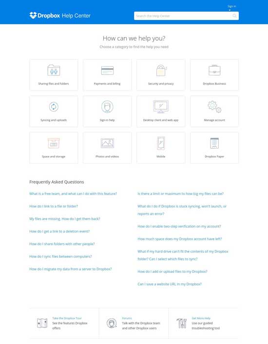
In the case of Dropbox, they've organized their knowledge base to reflect their typical user. For them, it's more common to have their users access topics like "Payment" and "Security" before searching the FAQ knowledge base. Know your end user and design your knowledge base to fit their needs.
In the end, your knowledge base should anticipate your end user's needs with simplicity and empathy. It should communicate to your customers that you care and you believe there's no question that can't be answered or problem that can't be solved.