Don't take viewers to the final step only to have them shrug and close their browser without taking action. Because let's face it, your contact page could be all that's standing between you and a great relationship with a new customer.
How exactly do you create a contact page that's consistent with your brand while being engaging enough to make a viewer want to make a purchase or hire your services? There's no doubt it's got to go beyond the standard phone number and email address, but what actually works and what doesn't? Check out our list of 8 tips, strategies and examples that will increase your chances of converting browsers to buyers.
First and foremost, the thing has to work. There's nothing that tarnishes your brand and loses you customers like a page that's broken or doesn't send properly. It may seem obvious but test to make sure all links function properly and your contact information is correct.
And we've mentioned this before, but it bears repeating-with so many people using mobile devices to surf the web, it's important your contact page has a responsive design and reads across multiple formats. Test to be sure it can be read even on small devices.
When a visitor to your website makes the commitment to contact you, don't lose them to a page that doesn't fit your branding. Make sure your page grabs their attention. Your snarky tone, humorous photos or quirky style should follow through to your contact page. The contact page may not sound interesting, but if you have a poorly designed page, viewers won't be interested in going that next step to contact you.
Music City's contact page does a great job of showing their quirky nature, while still remaining professional. The right side looks very much like a message board you'd have on the fridge, while the high quality photo makes it fun and informal.
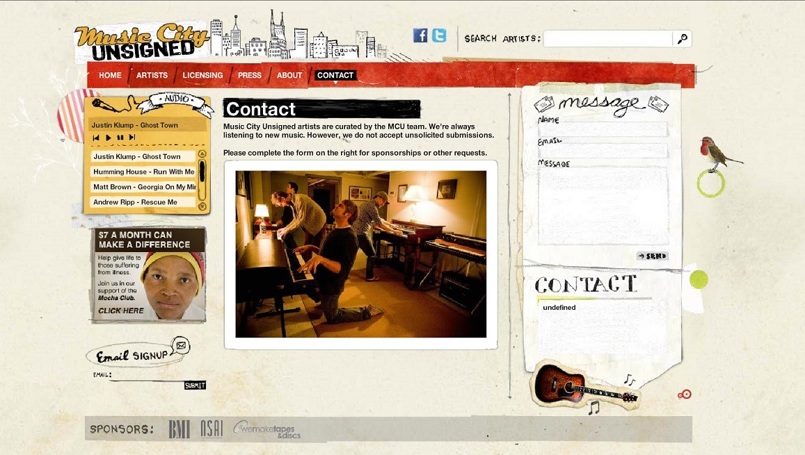
With social media on the rise, businesses understand that increasing their Facebook fans and Twitter followers leads to more customers. Create a professional, yet humorous way to encourage visitors to friend and follow.
We like the simple, but effective design of Built by Buffalo, a web design company. They've kept their contact page consistent with their page formatting and included links to social media sites that translate even to mobile devices.
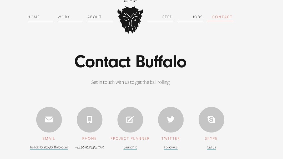
We've said it over and over-every page of your website needs to have a visual hierarchy and your contact information is no different. Though your design team has created a great map or taken some awesome photos of the office, it's not always best for your business to put the cool media at the top of your contact page. If your business depends on contact from potential customers, be sure the actual form is front and center with less important information below.
Digital Base not only uses a great visual on their contact page, they've separated information into columns for easy readability. Scrolling to the bottom of their page, visitors find a map with their location. A great overall professional agency page that is neat and purposefully put together.
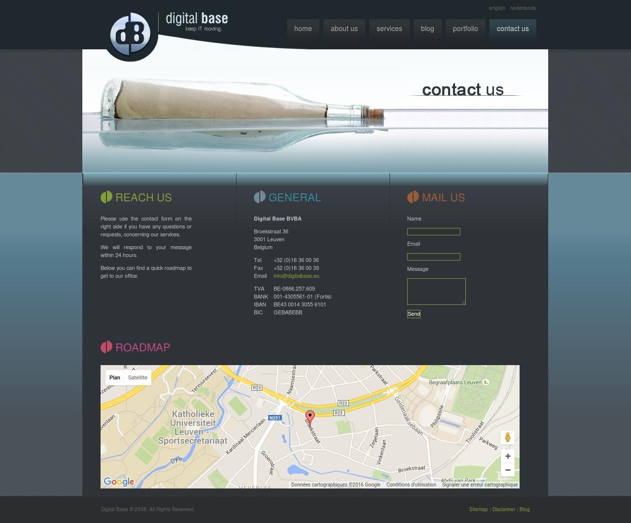
If your business depends on customers finding a physical building, don't hesitate to use a map as the image for your contact page. Just be sure to use a contrasting font color and weight that makes your pertinent contact information legible.
Code Quest has done so much right in the design of their contact page. From a map showing their location (and inviting you to drop by for a cup of coffee) to including their social media links right through to reassuring visitors they'll keep their private information safe, there's nothing they've missed on this page.
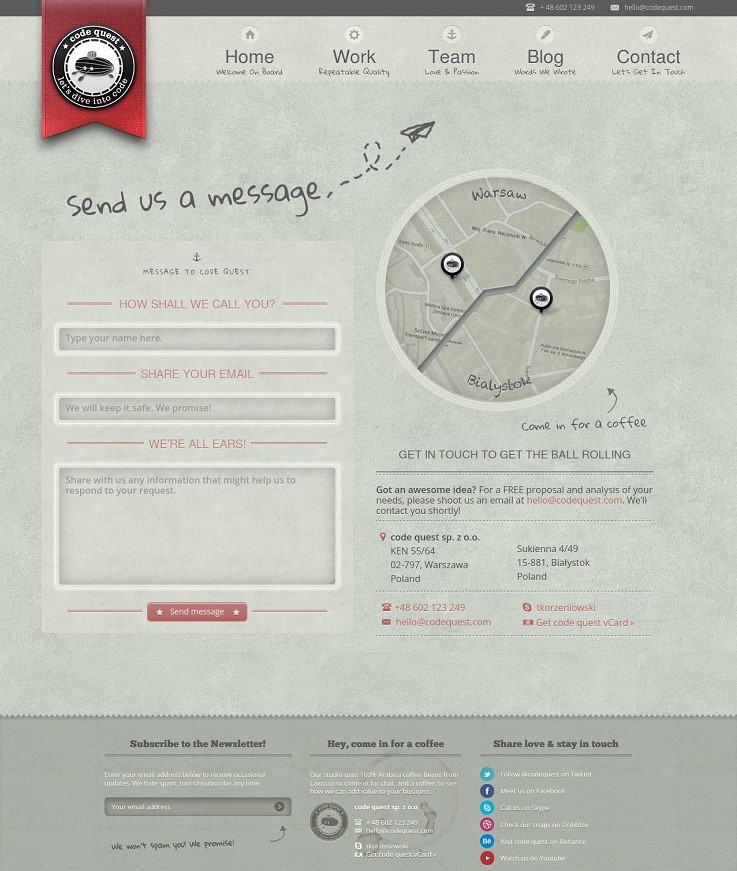
Be sure your contact page sets the ground rules for future communication. Statements like "We don't respond to advertising opportunities." or "We check our email twice a day and reply even during lunch." make bold statements about who you are and how you do business.
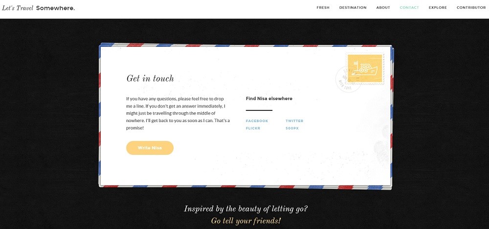
Let's Travel Somewhere has done so many things right. This site invites world explorers to share their travel experiences through photos and shared experiences. What better way to illustrate this than through a postcard. Notice she's also got links connecting visitors to her social media sites as well. Top marks all around for this contact page.
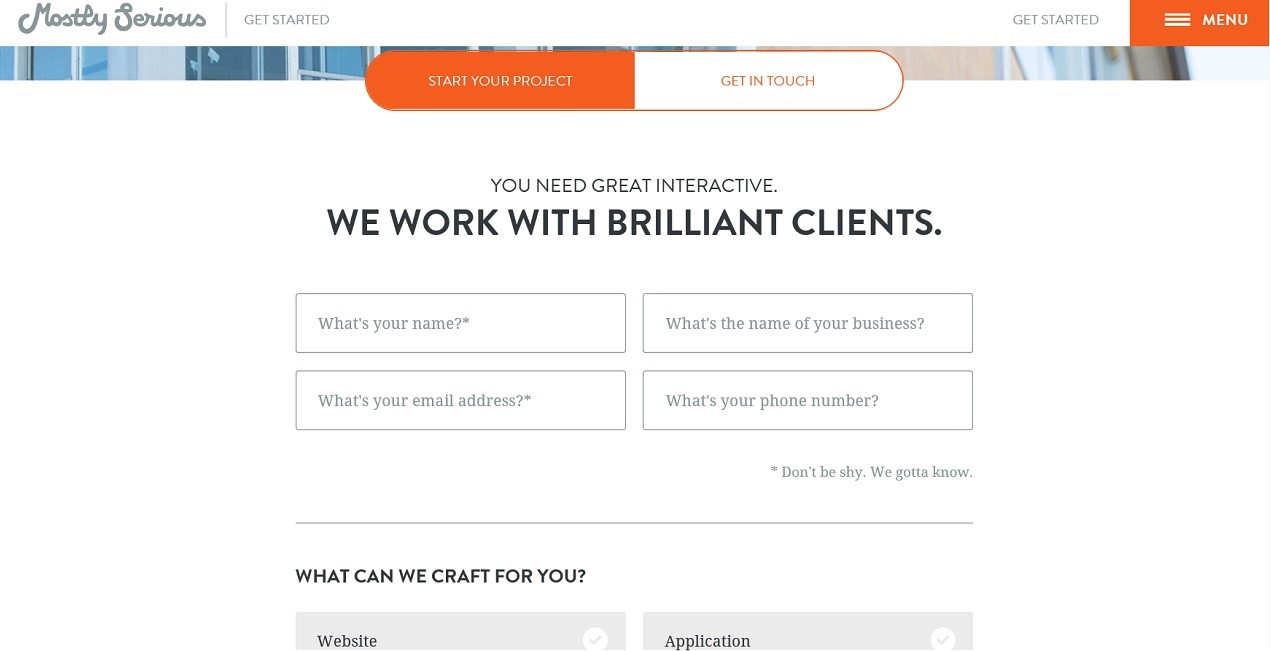
Some businesses have potential customers who want to just "touch base", while other visitors may actually have already done their homework and want to purchase your product. If your company falls into this category, consider having two call-to-action buttons for potential customers to contact you.
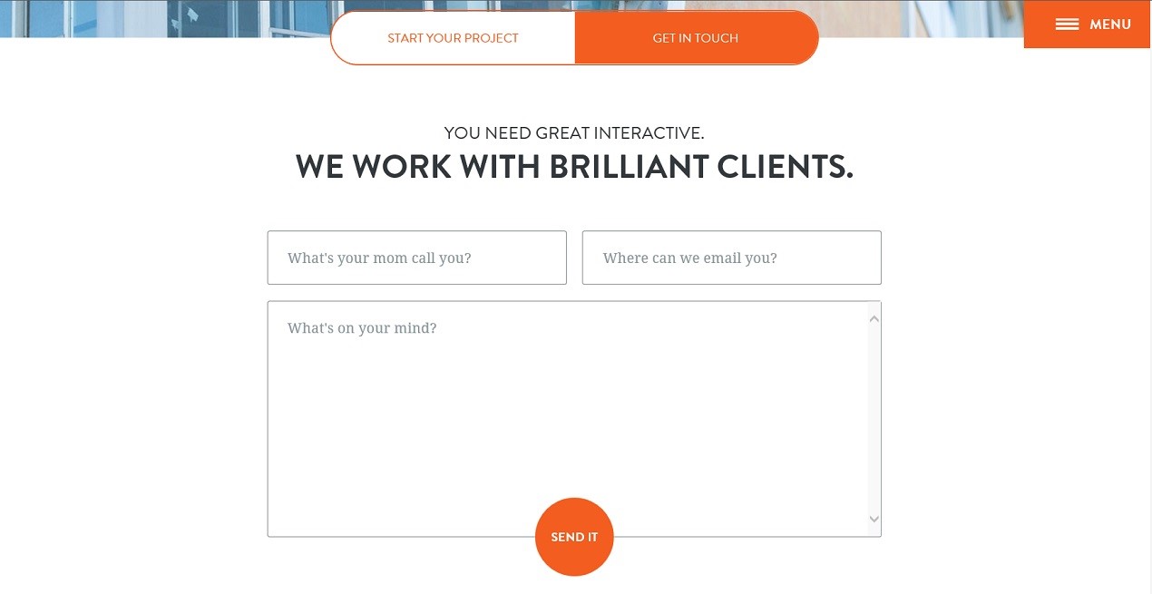
Mostly Serious, a digital marketing group has done a great job offering potential clients two options for contacting them. Whether visitors just have a question or they'd actually like to get started on a project, this contact form allows them to toggle between the options. We also like how they've included their tagline and the light-hearted way they've indicated how to complete the form.
Always respond. This seems like a no-brainer, but not responding to legitimate Skype contacts, tweets or emails, especially if you've mentioned a timeframe on your contact form, is a great way to guarantee you've broken up with your customer without ever truly having begun the relationship.
In the end, it's important to keep in mind that your contact page does a lot of heavy lifting for your business. Nine times out of ten, people are going to want to communicate with you about your product or service before becoming a client, so don't skimp on your effort to make your contact page unique and engaging while keeping them simple and user friendly. A well designed contact page may very well increase your conversion rate and boost your bottom line.