As consumers continue to spend more of their time shopping for products and services on the internet, companies are challenged with the task of building trust with users of their site without the benefit of personal contact. Unlike the inviting smile of a receptionist or the friendly voice of the person answering the phone, your website may be the only contact you have with potential customers. Users want to know at a glance, who you are and what you can do for them.
Any industry where the people behind the company are as important as the products and services offered, should not gloss over the importance of their "About Us" page. The expanded "Meet the Team" pages are increasingly becoming one of the highest ranked pages on many websites. But creating a page that engages the user while remaining personal and friendly, can seem like a daunting task. Not to worry. We've scoured the internet and come up with a list of 5 best practices for creating a "Meet Our Team" page that will keep your company website from being just another hastily browsed, easily forgotten site in a crowded jungle of websites.
Let visitors to your site see the real you. Don't simply take headshots of your employees, add a couple of cliched statements and trust that's enough to hold the attention of visitors. Think outside the box, while at the same time keeping with the branding of your company.
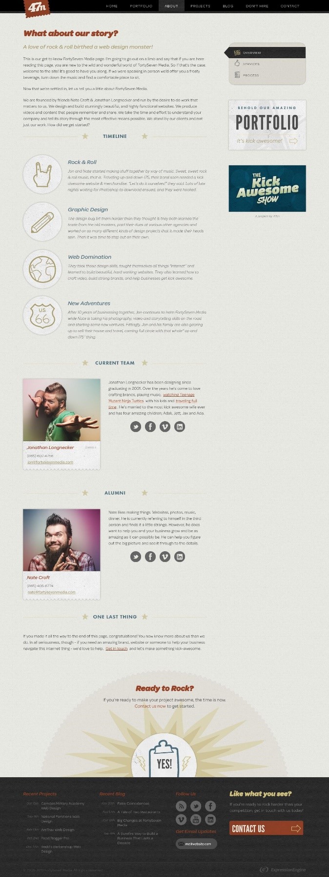
A great introductory paragraph inviting virtual guests to find a comfy seat and enjoy a frosty beverage, sets the tone for this company. A timeline of how the founding friends first got hooked on graphic design and built their business, is followed by two great pictures of the founders along with quirky bios about doing some serious marketing and website design for businesses.
This is a PR company working with organizations on creative design for advertising and website design. Not only is the page an eye-catching bright yellow, their text and great picture animation definitely make this a unique experience for visitors.
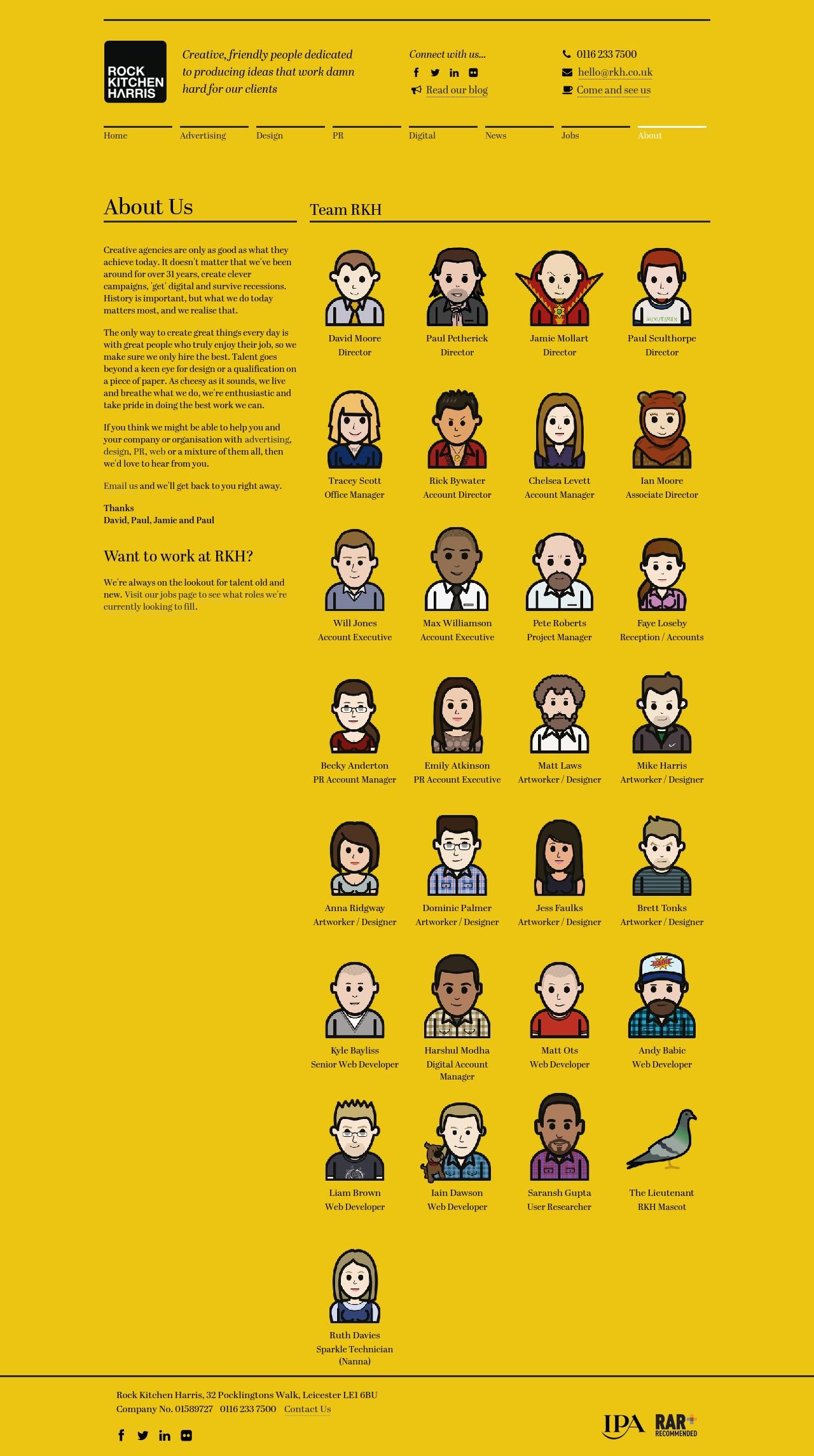
With less and less face-to-face time with your customers, it's important to make a lasting impression. If you have a relatively small team, make your pictures as big as your company. Adding personal touches to the photos such as artistic creativity, beloved pets or hints at favorite leisure activities, all make you and your team feel more real in the virtual world.
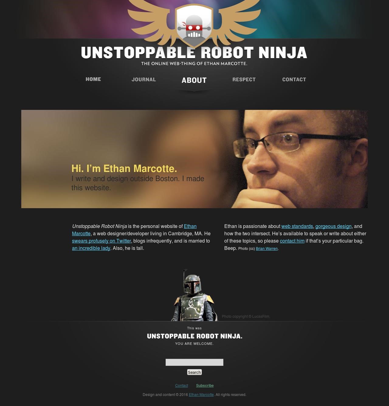
Not only does Ethan Marcotte have a great website name, his about page is well… all about him. With a large picture, a simple statement of what he does, and bio details with clickable links to social media and examples of his work, this page hits all the right notes. (And what's not to like about the rotating ninja picture at the bottom of his page?)
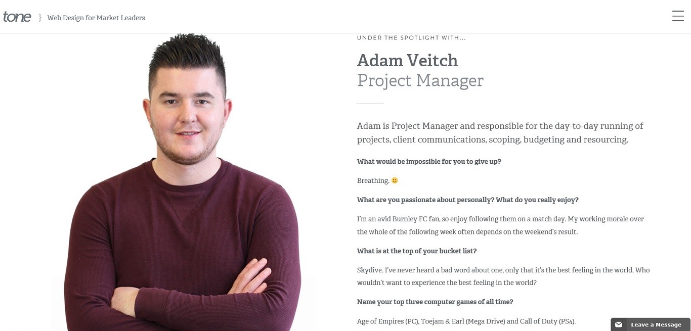
Adam Veitch is the project manager of a web design company, promoting itself as a lead generation agency. Not only has he made his picture large, his answers to quirky questions let potential clients know they're definitely a "little bit different from your garden variety digital agency".
Let's face it, no one knows the real you better than you. But don't overwhelm visitors with too much information or details that aren't necessary. The best Team Pages are those that offer the facts about your employees without being too wordy. Make sure the information you're posting is well organized with plenty of white space, different size and color fonts and with easily digestible blocks of text.
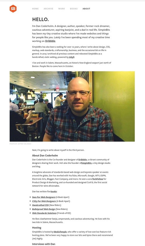
First, his opening bio is entertaining, his picture is engaging and he's taken time to create lists with clickable links with brief descriptions to his interviews and podcasts. Pure organizational perfection.
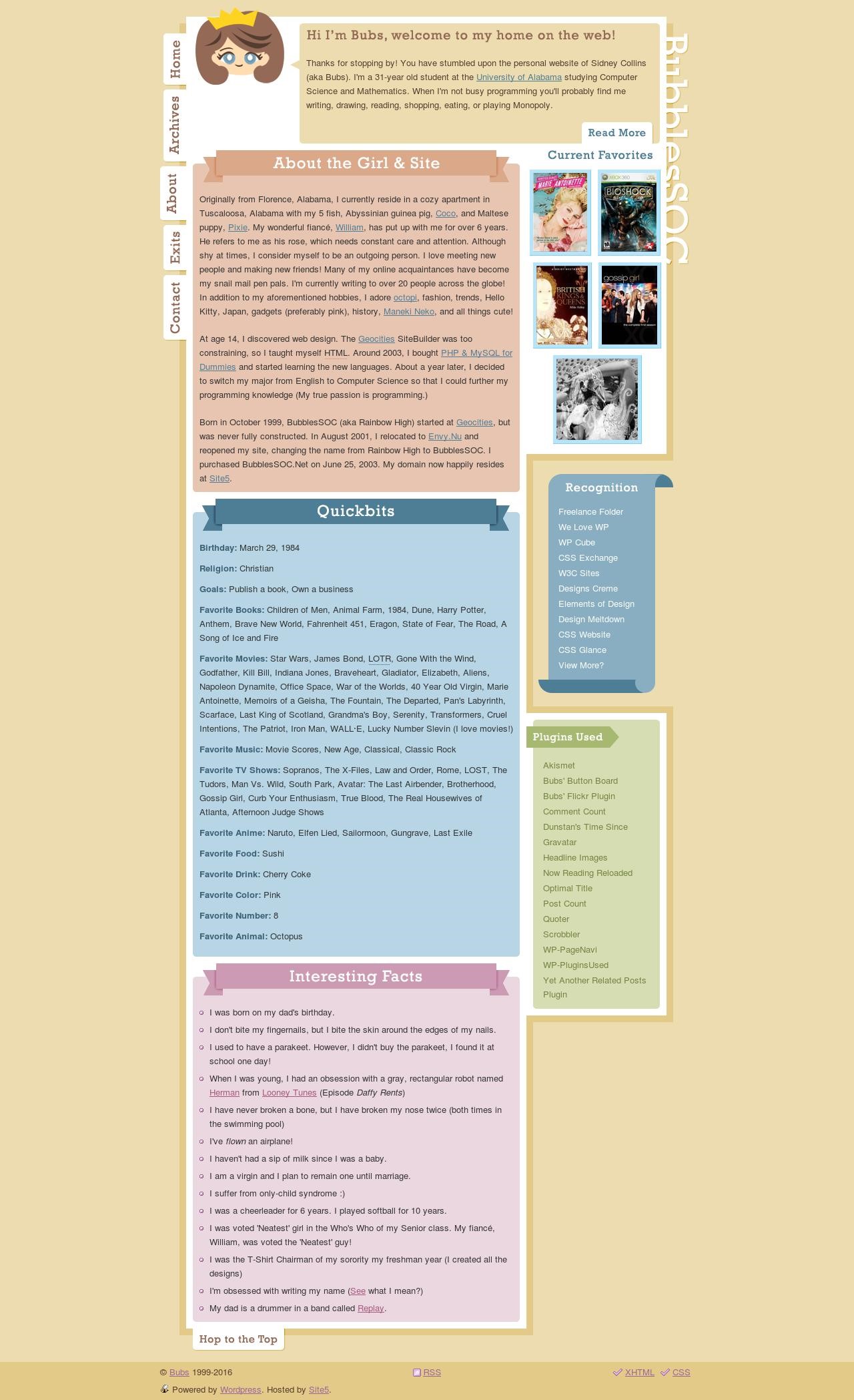
Chunky, colorful boxes make this well organized for both the browsing visitor and the user who's looking for more in-depth information.
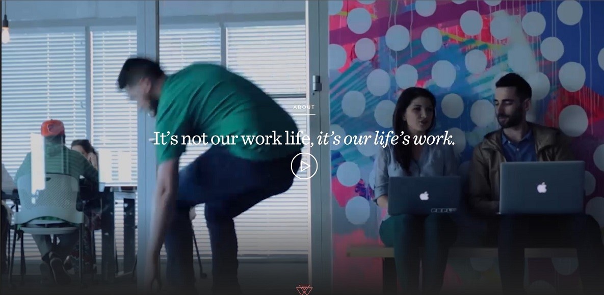
With video clips become ever more popular on websites, why not consider offering visitors a visual display of who you are and what you do.
Purple, Rock Scissors, a digital creative agency working with customers on branding has a website that is as unique as the services they offer. Clicking on their "Get to Know Us" button brings you to the webpage below, where a play button opens a short video showcasing their team at work and at play, ending in one of their team painting their logo on a large canvas. Ingenious in its simplicity and originality, this one gets top marks.
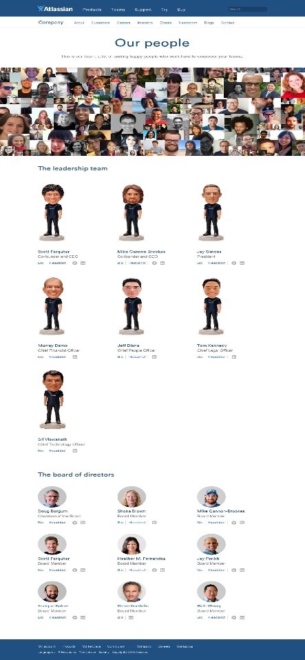
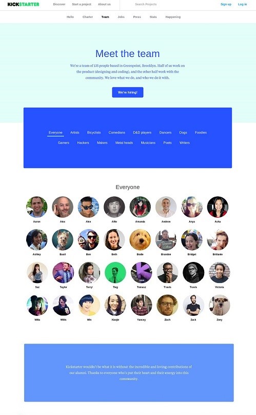
If your business relies on a large team of individuals, consider using only headshots with drop down or pop-up boxes containing specific details about your team members. This keeps the page clean and clutter free.
So many great things to love about the uniqueness of their team page. They've filled the top with casual photos of their team members. Scrolling down, they've showcased their leadership team as figurines and board members with headshots. Lots of white space with clickable links for a detailed bios on team members keeps this page clean and clutter-free.
This company helps artists in different fields find the resources to fund creative projects. We love the way they've got alphabetized headshots of everyone on their staff (included the 4-legged members who join their humans at work). Scrolling over a picture offers the user a color-coded drop down box containing specifics about the team member. Users also have the option to view team members only in their specific fields like comedians, poets, musicians, etc.
Creating a team page isn't easy, but it's worth every minute you spend on making it uniquely yours. Give your visitors a chance to see the human side of your company by putting a face to the name. Whether you're a freelancer trying to entice users to check out your services or a company looking to introduce a whole team of talent, we hope the above examples will inspire you to put your best self out there.