It's easy to make a great first impression, but are you paying attention to that critical final impression? With more and more people using the convenience of email to stay in contact with customers and co-workers, it's essential that the end of any communication you send is as memorable as your business.
That's a lot to ask of 3 to 4 lines of text, but don't worry, we've done the heavy lifting for you. We've consolidated a list of 10 ways to make your email signature go from bland to grand with just a few simple changes.
We adhere to the KISS principle-keep it simple. This is a signature, not a mini autobiography filled with links, quotes and an overwhelming amount of information. Too much information makes your signature bulky and cumbersome, keeping many from even reading through, let alone clicking on your links. Limiting your signature to pertinent information like: logo, name, title, company, phone number and social media links keeps it clean, easy-to-read and more importantly, puts your brand front and center.
Additionally, don't hesitate to add personality to your signature with a quirky title or tagline that fits your brand.

When designing your signature, keep your color palette small. Look to your logo in choosing colors for design elements. If your logo is black, then choose colors that complement your external branding. The same is true of your font. Using too many font types confuses the eye and keeps the recipient from reading all of your information. Choose a font type that has several weights and/or colors, allowing you flexibility to highlight lines of text within your signature without being distracting.

Use weighted fonts and varying sizes to create a hierarchy of information. A reader's eye is natural drawn to heavier, larger fonts and should flow naturally to the additional information listed below. Highlighting and bolding will visually guide the reader logically through your signature.

If a large part of your brand includes social media, be sure to include hyperlinked icons. With over 100,000 social media icons available it's easier than ever to find a style that complements your brand. Not only do icons save space and keep your signature from looking clunky, they make it easy for people to find other avenues to contact and follow your business.
This professional skateboarder has done so much right with her email signature. She chosen colors that work well together without overwhelming the eye and her social media icons are as unique as her skateboard designs.

The difference between a neatly organized, simple to read signature and a chaotic mess that looks thrown together is alignment. Keep your signature left aligned, with all design, photo and font elements organized in a logical and simple way that is easy to navigate.
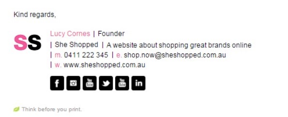
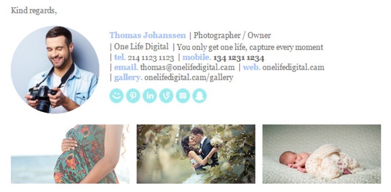
Adding an image is a great way to personalize your signature. Adding a face to the name also aids in brand recognition.
We like the way this photographer not only added a personal photo, but the photos along the bottom of his signature tell customers what types of photos he shoots without having to add additional lines of text.
When designing your signature, it's important to keep in mind that the vast majority of people are now accessing their emails on mobile devices. Mobiles are significantly smaller than computer monitors. Be sure to design a signature where both your font and imagery are legible when scaled down to smaller screens and where links can be accessed with a thumb-tap. Icons that are too small or too close together, make it difficult for a mobile user to access your social media or website links.
Additionally, studies have shown that seeing "Sent from my iPhone" adds credibility to inadvertent misspellings that sometimes sneak into our emails. Don't be afraid to experiment with various forms of this statement to see what brings results.

If your company is looking to increase click-throughs to a demonstration, event or downloads, consider adding a hyperlinked call-to-action.

Though it's perfectly acceptable and proper business etiquette to end your email with "Sincerely," "Take care" and "Best", but these salutations won't get you noticed. Consider using a unique signoff that interjects your personality and fits your brand. Are you snarky? Bubbly? Fun? Creative? Use these traits to your advantage and signoff in a surprising way.
There are several services available now to help you design an effective email signature. Whether you're looking to add your image or icons, most of these services have menu features that allow you to plug in your personal information and generate a eye-catching email signature that promotes you without overwhelming the reader.
Email Signature Rescue This program has easily customizable templates for creating a professional signature
WiseStamp This free email signature generator integrates with your email client. This program makes it easy to add a photo as well as hyperlinked icons and even an RSS feed that pulls your latest blog or social media content.
NewOldStamp If you're looking to create something unique, this is the program. With 11 signature templates in a variety of formats and colors, this is another easy-to-use program that allows your creative side to shine.
Our thanks to Email Signature Rescue for the image examples in this article.