Pages of Frequently Asked Questions – or FAQs – are sometimes considered a necessary evil by web designers. You need to have a knowledge base for your customers, but if you're not careful, you risk creating a disorganized mess where you lose viewers.
To help you decide how to make your FAQ pages shine, we put together a list of ten great FAQ pages, as seen in the wild. Model your site after these, and you'll be moving in the right direction.

For clear, concise delivery of information, it doesn't get much better than Goulet Pens. What's fantastic about this site is that it clearly separates FAQs about mailing and programs from common questions about the site's main product, fountain pens and accessories. Those get placed under Resources, the link to which you can see in the navigation bar.
Customers at Goulet know that when they have a question about HOW to buy, they go to FAQs, and when they need to know WHAT to buy, they go to resources. This clear differentiation makes things easier on the customer as well as the business!

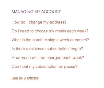
Purple Carrot is one of the many food delivery services that has grown popular in the last few years. While the rest of their site is graphics heavy, their FAQ page is clean and simple. Their questions are well organized into groups, letting users easily navigate to what they need to know, and the responses are thoughtful and useful. Finally, they've incorporated a search function, which can help customer search for long-tail keywords.

Cards Against Humanity is a card game that can be described as Apples To Apples for people with a … different sense of humor. This FAQ page is an excellent example of how you don't need to completely abandon the tone of your website in order to have a useful and helpful guide for your customers. Cards Against Humanity presumes a certain sort of snide sense of humor for their users, and therefore can get away with calling this section "Your Dumb Questions."

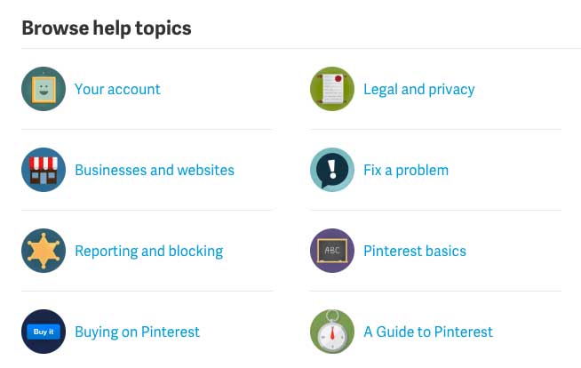
In the past few years, Pinterest has become famous as a visual bookmark site where users catalog recipes, beauty tips, craft projects, and interesting articles, among many other things. Since the site made waves with its graphic categorization, rather than text based communication, it makes sense that the FAQ page relies on a combination of graphics and text to help the user find the information they want.
The page also incorporates a search box for long tail keywords and a list of popular and interesting articles.

When you're talking about budgets to those who love them, it is impossible to talk for more than a couple of minutes without someone bringing up You Need A Budget. Often abbreviated as YNAB, this is a combination of a desktop platform, a new web app, and a different approach to your money than is taken by other budgeting sites.
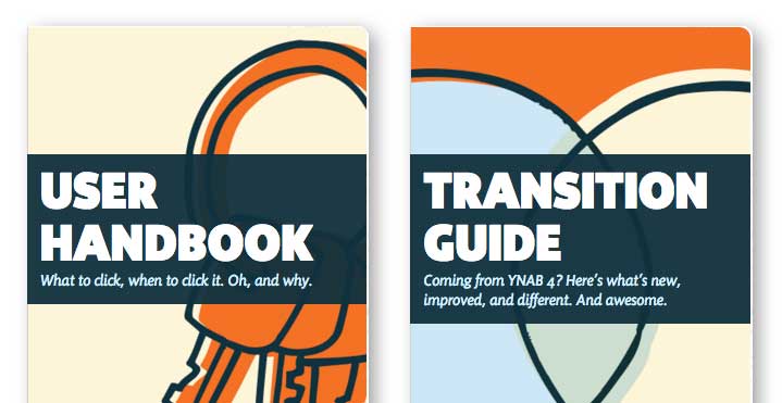
YNAB also takes a very different approach to its information page. Not content with a simple FAQ, YNAB offers its customers many different ways to find the answers they need and connect with the software and budgeting process. From guides to searchables to blogs to classes, YNAB offers information in every method someone could choose to consume it. Yet their Learn page is neat and clean, organized, and helpful in terms of finding what you need when you need it.
When you're designing your webpage, don't let your FAQs be a throwaway with some boring questions and lousy code. Just like every page of your site, this is an opportunity to communicate your brand and accentuate your marketing. Customers want to know that when they have questions or need help, you're going to be there for them. FAQs are just one way to show that you'll still be around even after the customer's money is in hand.
What's your favorite FAQ page on the web? Why do you love it?